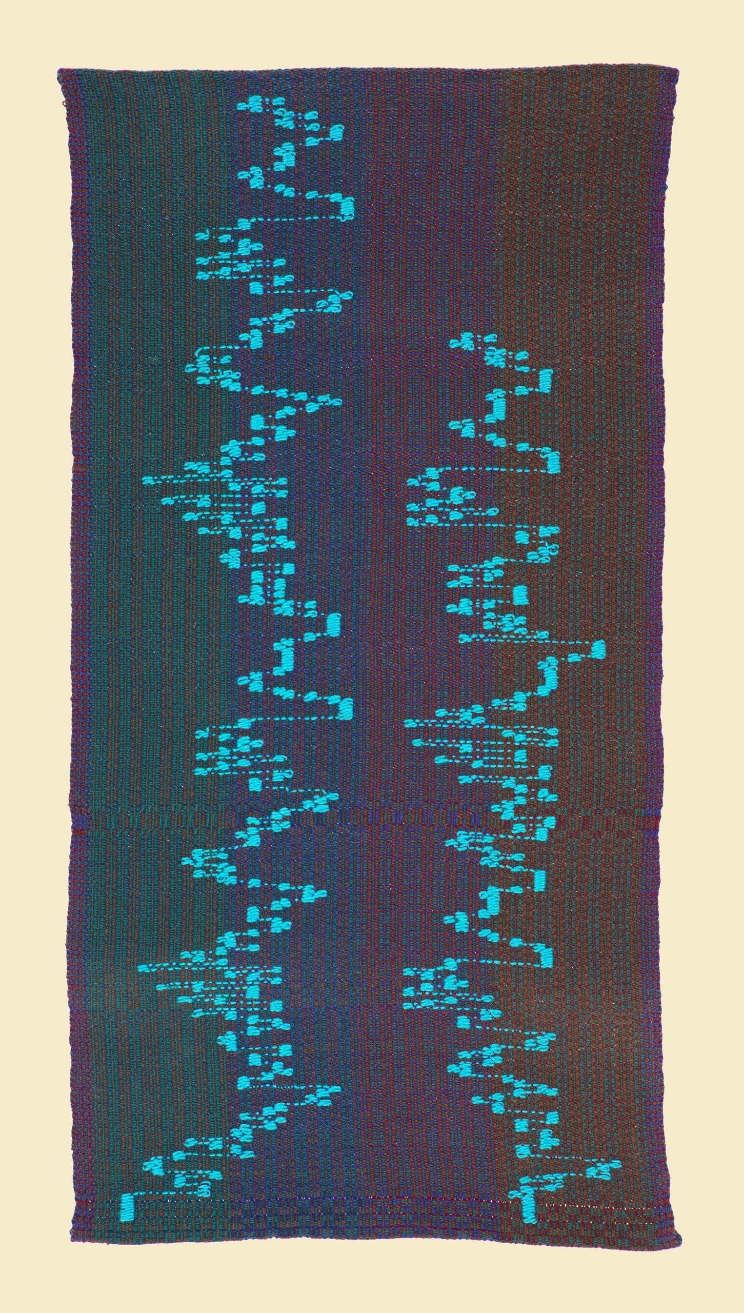
Contrapunctus 15
Interested in purchasing “Contrapunctus 15”? Contact the artist here.
“Contrapunctus- 15” is built in augmentation and contrary motion. Augmentation means the same theme but all the note values are doubled making the perceived “speed” twice as slow. Visually, everything is bigger in length. Contrary motion means whatever goes up as in intervals, goes down and visa versa. It is in effect an inversion of the theme.
The sound of this canon seems straightforward. All etc complexity happens in the score. But Bach produces another variant which creates a kind of cosmic balance. The two voices exchange themes. What was the original theme is now evolving in what was the contrary voice and the coutrary theme belongs to the original voice.
Visually, I chose to make that juncture the focus and to use the simplicity of two colors. This was one of the challenges in determining what each fugue would look like and what the visual effect was of all the panels together. The color road map needed to be consistent and yet not overwhelm. If one tried too hard to keep track of the color sequencing, I felt it would deract from the perception of the visualization of the fugues.
